MONARU
Team
Man Yan Chiu, Pooja Cavale and Kaanchi Chopra
Role
Ideation, User Research & Testing, Prototyping, Branding
Tools
Figma, Adobe Illustrator, Adobe XD, UserTesting.com
Duration
3 Weeks
Project Brief
During Brown University’s User Interfaces and User Experience course, we were asked to choose any one start-up from Y Combinator’s S19 Demo Day to design an interface for them.
We chose to prototype a mobile application for Monaru - a startup helping people be intentional with their relationships. Their goal is to help you stay close and connected with your family and friends.
Our Solution
Built on the idea that time and effort should be put into maintaining personal relationships, Monaru is a virtual assistant that aims to help users build deeper connections with the people they care about and develop positive qualities like thoughtfulness.
PROCESS
EMPATHIZE
For the preliminary research phase, we read contextual studies and conducted interviews to better understand Monaru’s target audience.
Monaru’s target user group are Millennials who are keen on developing a deeper connection with their family and friends.
Constant availability gives the illusion of connection. Online shopping, on-demand streaming, and working from home all corrode opportunities for human interaction. We found out that Millennials (23–37) are four times lonelier than seniors, and Generation Z (18–22) is the loneliest.
Robin Dunbar, a reputed anthropologist and evolutionary psychologist, discovered that humans can only maintain about 150 relationships in their lifetime. The same research found that we need 20 deep connections and 5 who we could rely on in a crisis. The average American, however, only has 2 people they can rely on.
Observations from our surveys concluded that students have the intent, but lack a platform that drives them to stay connected.
DEFINE
Human connection, a sense of belonging and community is the strongest determinant of a person's wellbeing. How we live defines how long we live. As college students, we are always swamped with classes, homework, and extracurriculars and finding time for our loved ones is really tough. In this process, many Millennials lose genuine connections and get distant from their families and friends. This is especially true for international students like myself.
Keeping this in mind, we developed personas for two students and the people they care about, which later helped us define our problem statement.
IDEATE
Our next step involved researching what the company is currently doing, developing low-fi mockups and designing a simple user flow.
So, we began by sketching 4 major screens in the app — profile page, home page, add reminder page, calendar page.
These screens enable users to perform the main function of the app: to add a reminder about an upcoming social event with their loved ones.
A systematic user flow was developed to map out the navigation experience of the app. Starting from the welcome screen, followed by highlighting the 5 major buttons on the navigation bar, and the sub-options to explore within them.
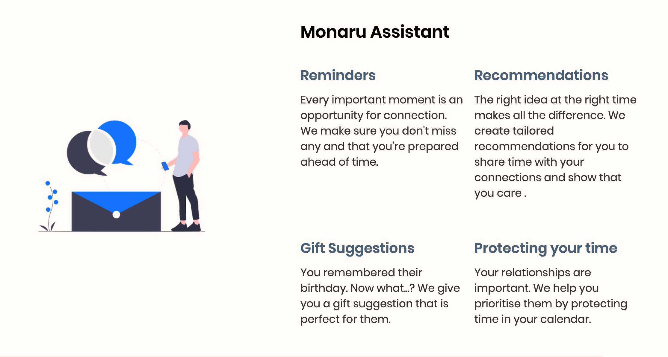
Monaru’s website states the aim is to provide reminders, recommendations, gift suggestions among other things to protect the user’s time and foster their relations.
We refined the lo-fi prototypes, and sketched more features.
PROTOTYPE
For the final design of the app, we first designated a universal style guide and then developed the high-fidelity prototypes.
Logo experimentation included playing with stroke thickness, colors and opacities to form a visual identity that matches the purpose of the brand.
Since this app is about maintaining relationships, a warm color palette is used to make it appear friendly. A clean-looking sans-serif typeface makes it easier for users to read the text on the app.
Instead of simply using a single-line text field and drop-down list, elements like horizontal scrolling time bar for setting the duration of events, and multiple selection fields for setting reminders were added to make the user experience of adding new events more interactive and satisfying.
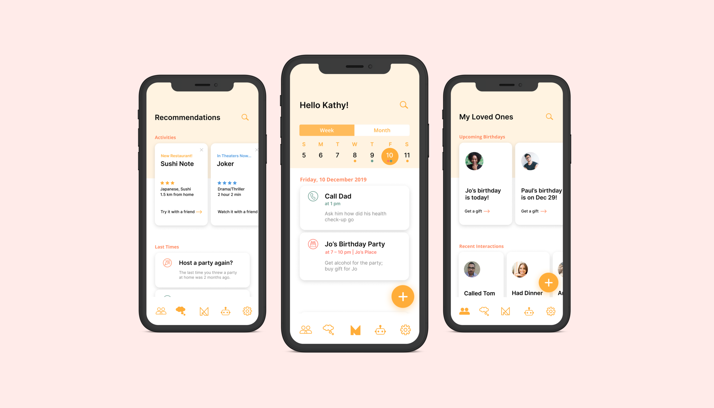
Based on Kathy’s previous interactions with Jo, the app suggested buying a candle set or leather bag as a birthday gift. The price suggested is within the range of Kathy, that she set up in the Profile set-up page below.
The app is highly customizable and addresses users’ individual interests and needs, and keeps in mind that they keep changing with time. The Profile Settings page allows users to change the main color of the app interface to their favorite color, and control the system-generated recommendations by telling the system their social activities preferences.
The first screen on the navigation bar is My Loved Ones page, where users can store information about the people they want to have a close connection with. An upcoming birthday section was added at the top of this page, so as to increase the effectiveness of the app in encouraging users to become a thoughtful friend.
The second screen is the Recommendations page, where the system will give users ideas on what kind of social activities they can try out with their friends. The last times function keeps track of information like how long have you not been in contact with a certain friend and serves as a friendly reminder for users to reach out to their loved ones. The app also suggests new things the user can try out, in regards to their geographical location, promoting in-person interactions.
The fourth screen is the Virtual Assistant screen where the user can chat with Ru (the assistant). Instead of manually adding the event, the user can use the voice function to ask Ru to do it for them.
TEST
With the interactive hi-fi prototype, we conducted our own usability test through a remote user testing service — UserTesting.com.
Feedback from 3 users, all female and within the age range from 22–32, was gathered.
TASK
The task given to the users to complete on our interactive hi-fi prototype was - “You want the app to remind you to have dinner at Mom’s place next Monday. What will you do?”
4 subtasks were given to the users, which are as follow:
Without leaving the homepage, what are your initial impressions of the app? Explain your answer.
Create an event to have dinner with your mom at her place next Monday.
One by one, describe what you think the icons on the navigation bar mean. Do not select anything yet.
In your own words, describe what the app offers. Be specific. Name at least 3 offerings.
HYPOTHESIS
Hypothesis for Subtask 1: Users will be able to say the function of the app — “social scheduling”.
Hypothesis for Subtask 2: Users will scan through the information on the homepage, and click the add button at the bottom right to complete the task.
Hypothesis for Subtask 3: Users will correctly guess what all 5 icons on the navigation bar mean.
Hypothesis for Subtask 4: Users will be able to name offerings like “give users social activity recommendations,” “help users keep track of their friends’ birthdays,” “remind users to catch up with an old friend,” etc.
RESULTS
Hypothesis 1: Accepted.
Hypothesis 2: Accepted by 2. Rejected by 1. Two users successfully added an event, however, one user didn’t realize the add event page is scrollable, so they clicked the back button instead of the “add event” button at the bottom of the page and did not complete the task.
Hypothesis 3: Rejected. Users could identify all icons, except all three users, were confused about what the thought bubble icon meant.
Hypothesis 4: Accepted. All three users were able to name 3 offerings that are similar to what we expected.
After receiving the feedback, we analyzed the results by calculating several metrics. Metrics like completion rate and error count reflect the effectiveness of the app, whereas metrics like average time on task reflect the efficiency of the app. Below is a table showing our calculations:
REFLECT
Inspired by the user testing results and our observation of user behaviors, we realized that the app needs the following adjustments:
Change the icon for the Recommendation tab (from the thinking bubble icon to a lightbulb icon)
Emphasize more on the virtual assistant nature of the app more (e.g. when users have no upcoming events today/this week/this month, the system can give some activity recommendations on the homepage)
Show a list of things that users can do with the virtual assistant (Ru) at the beginning of the conversation.
Add certain graphic elements (e.g. arrows) or text to indicate that the add event page is scrollable.


