FEDEX SILVER
Team
Arjun Shah and Kaanchi Chopra
Role
Research, Concept Generation, Illustration, User Experience Design, Process Book
Duration
8 weeks
Tools
Adobe Illustrator, Figma, Miro
Project Brief
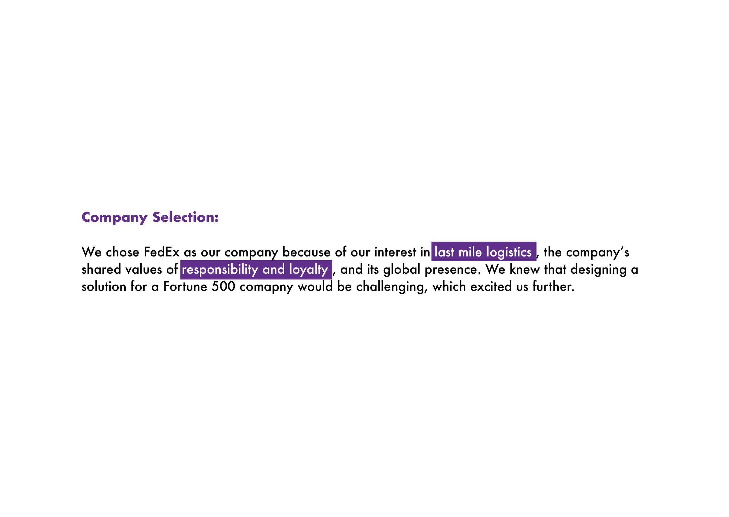
As designers, we were tasked with partnering with a company and raising their revenue by 20% through design-led innovation. We chose to work with the FedEx Corporation. How might we design a product/service that results in 20% growth for FedEx?
Our Solution
FedEx Silver is a platform that delivers packages and services past the door to Silvers by building on FedEx’s powerful logistics system, as well as using our specially trained FedEx Companions. FedEx Silver empowers seniors ageing in place by understanding their current needs and predicting for necessities in the near future, such that the Silvers’ independence and comfort are paramount.
PROCESS
UNDERSTAND
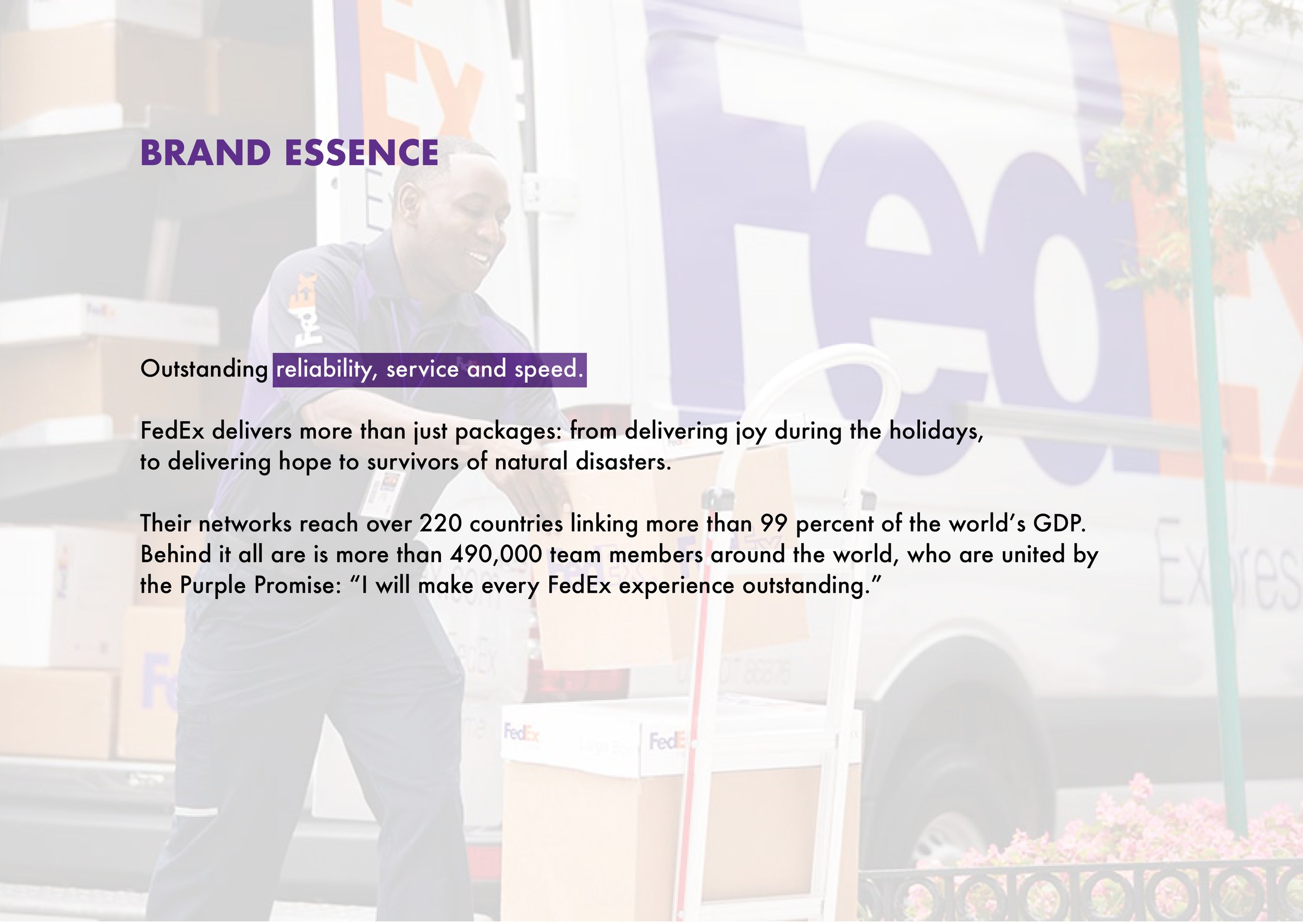
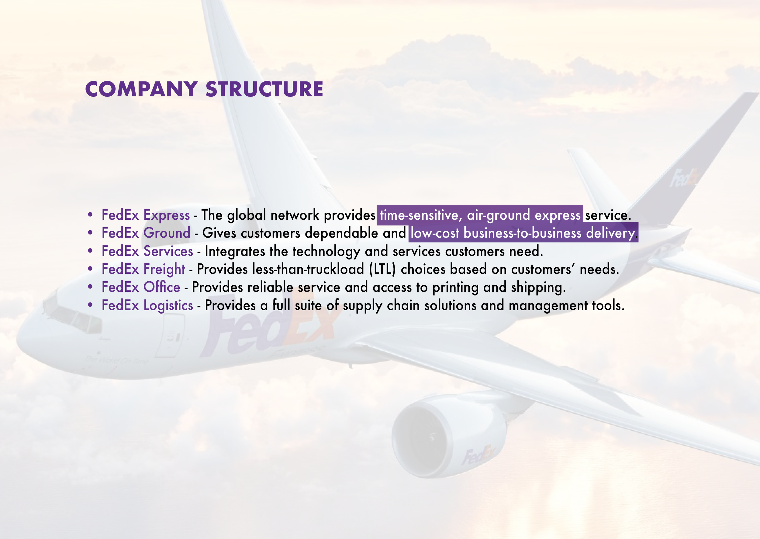
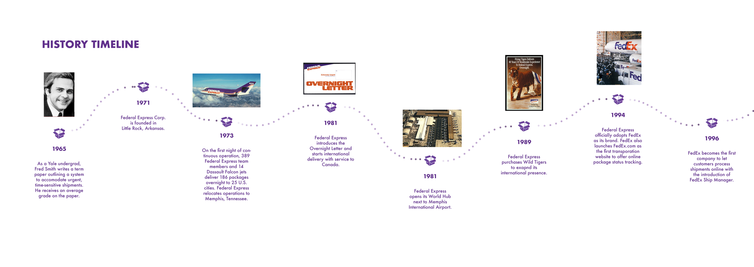
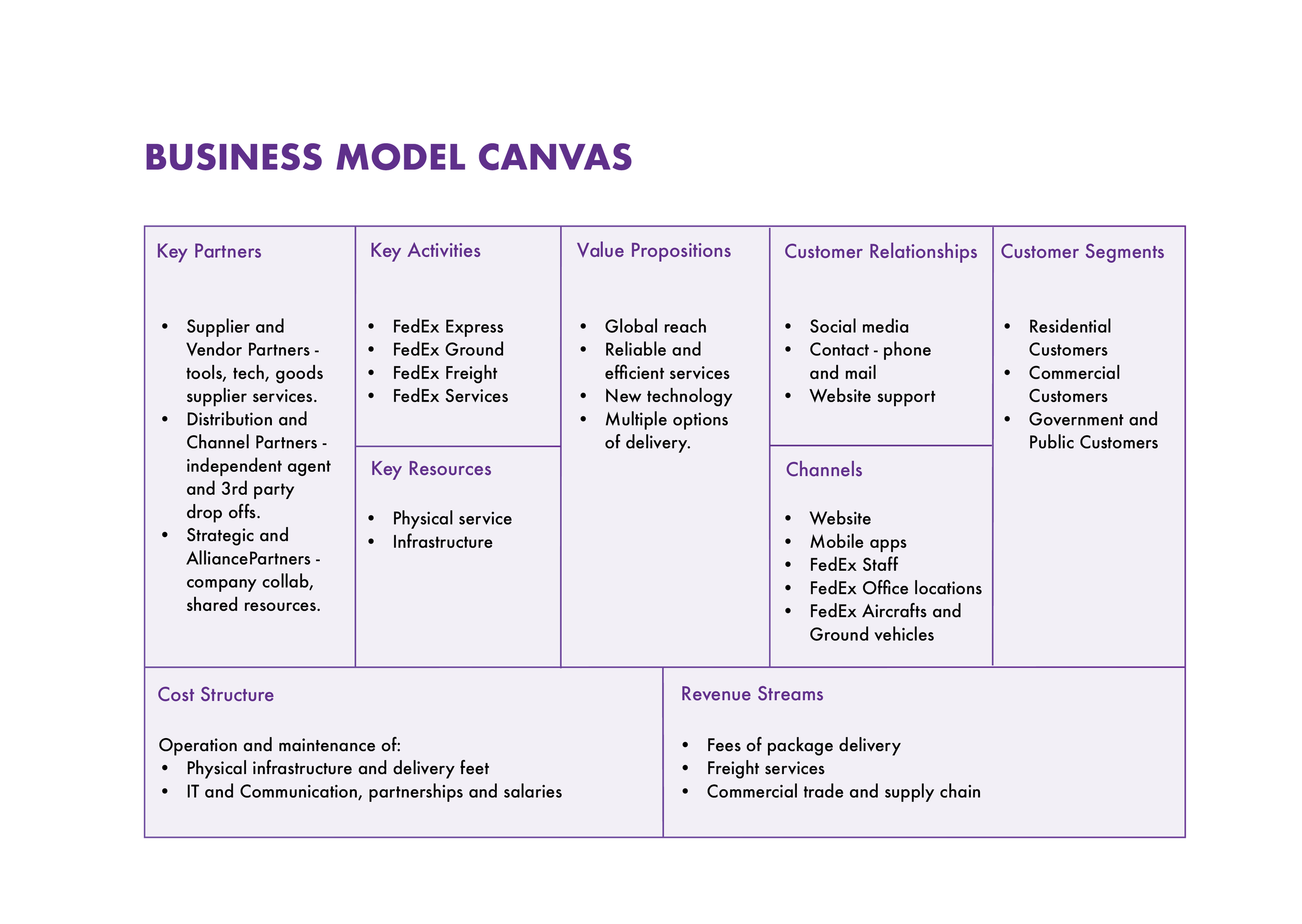
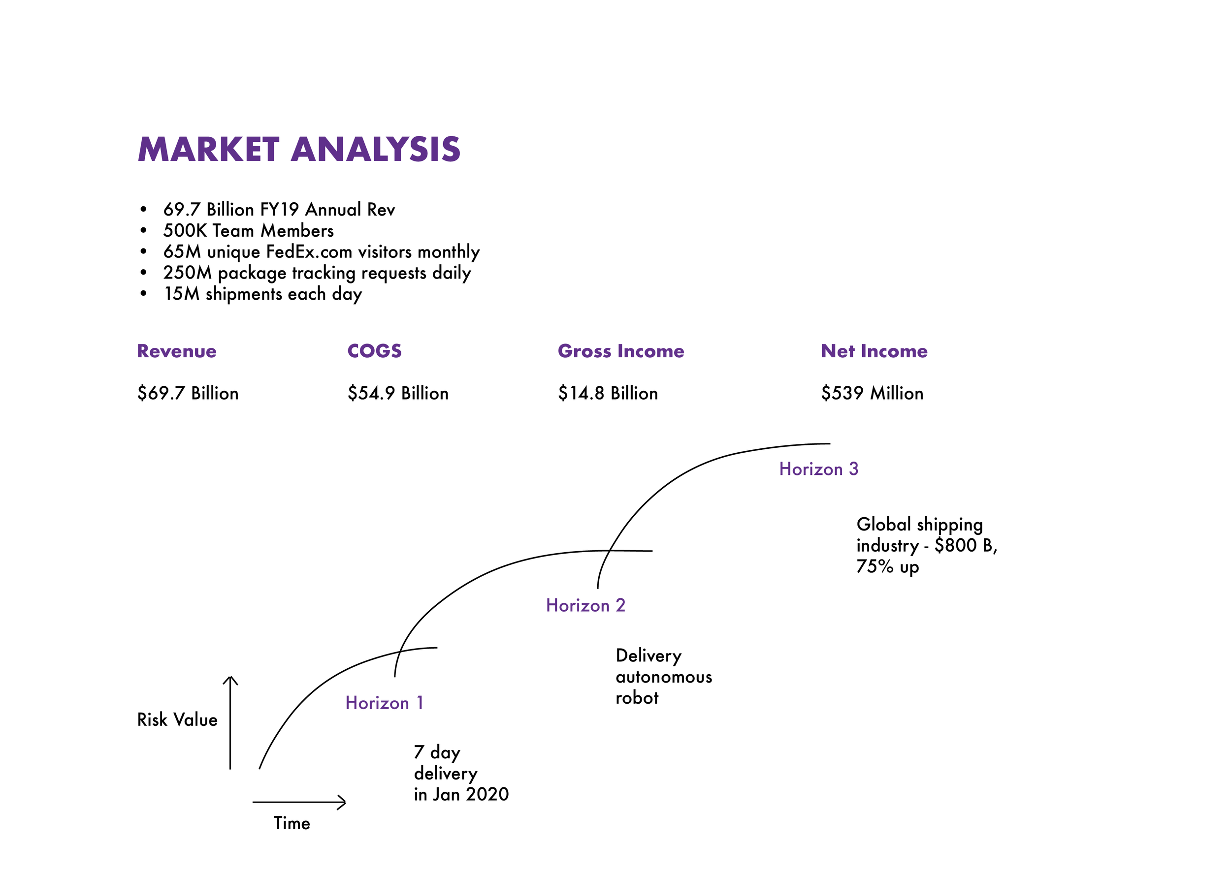
We researched the chosen company to understand its history, brand essence, structure and services. In our initial research phase, we dived into the business model to understand key partners, customer relations, value propositions and revenue streams. Analysing the corporation gave us insights into its financial arrangements, and we built horizon maps to find profitable opportunities that can lead to growth. After which a SWOT analysis helped us identify the internal strengths and weaknesses of the corporation, and the external opportunities and threats available. The analysis revealed the resources available that we can leverage to counter our shortcomings.
EXPLORE
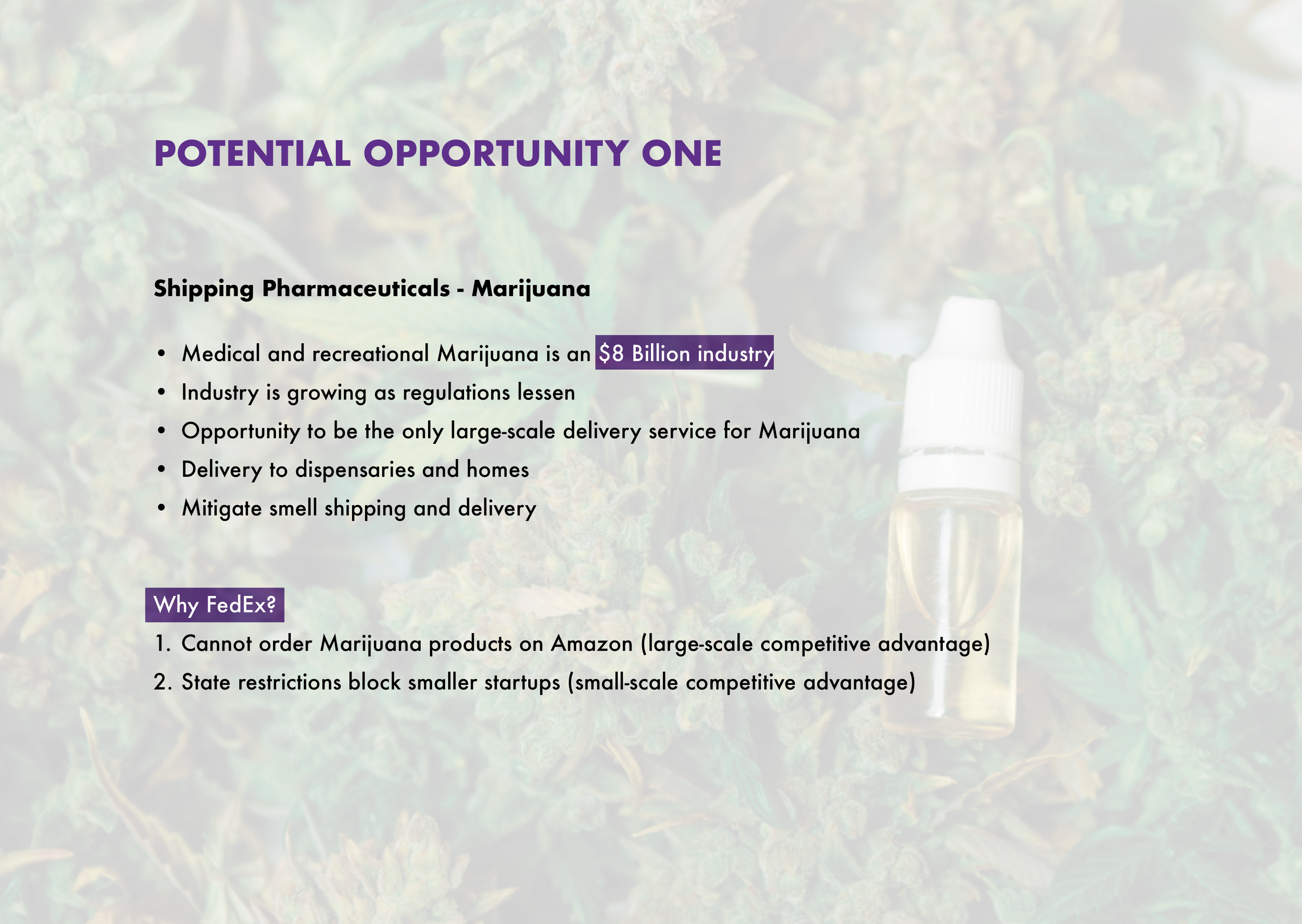
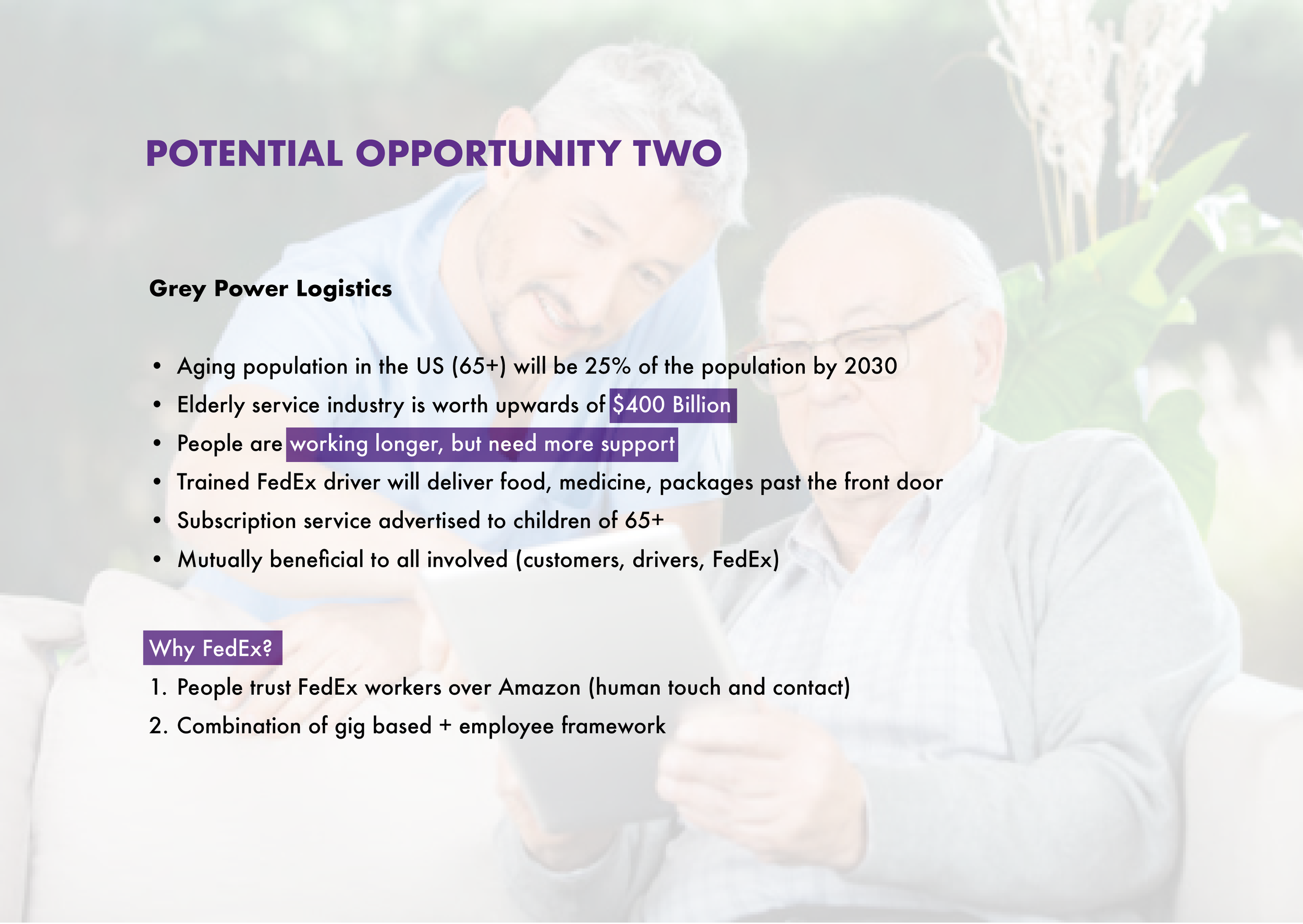
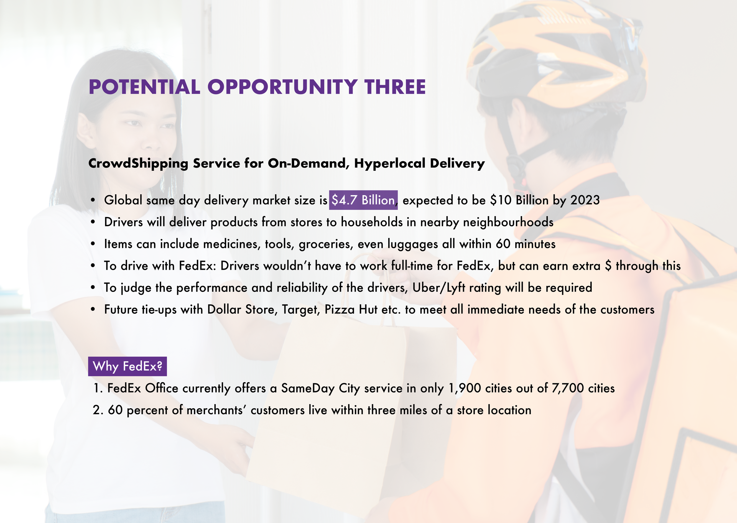
OPPORTUNITIES RESEARCH: We researched market trends in related industries like Healthcare and Logistics, and landed on three opportunities for design-led innovations.
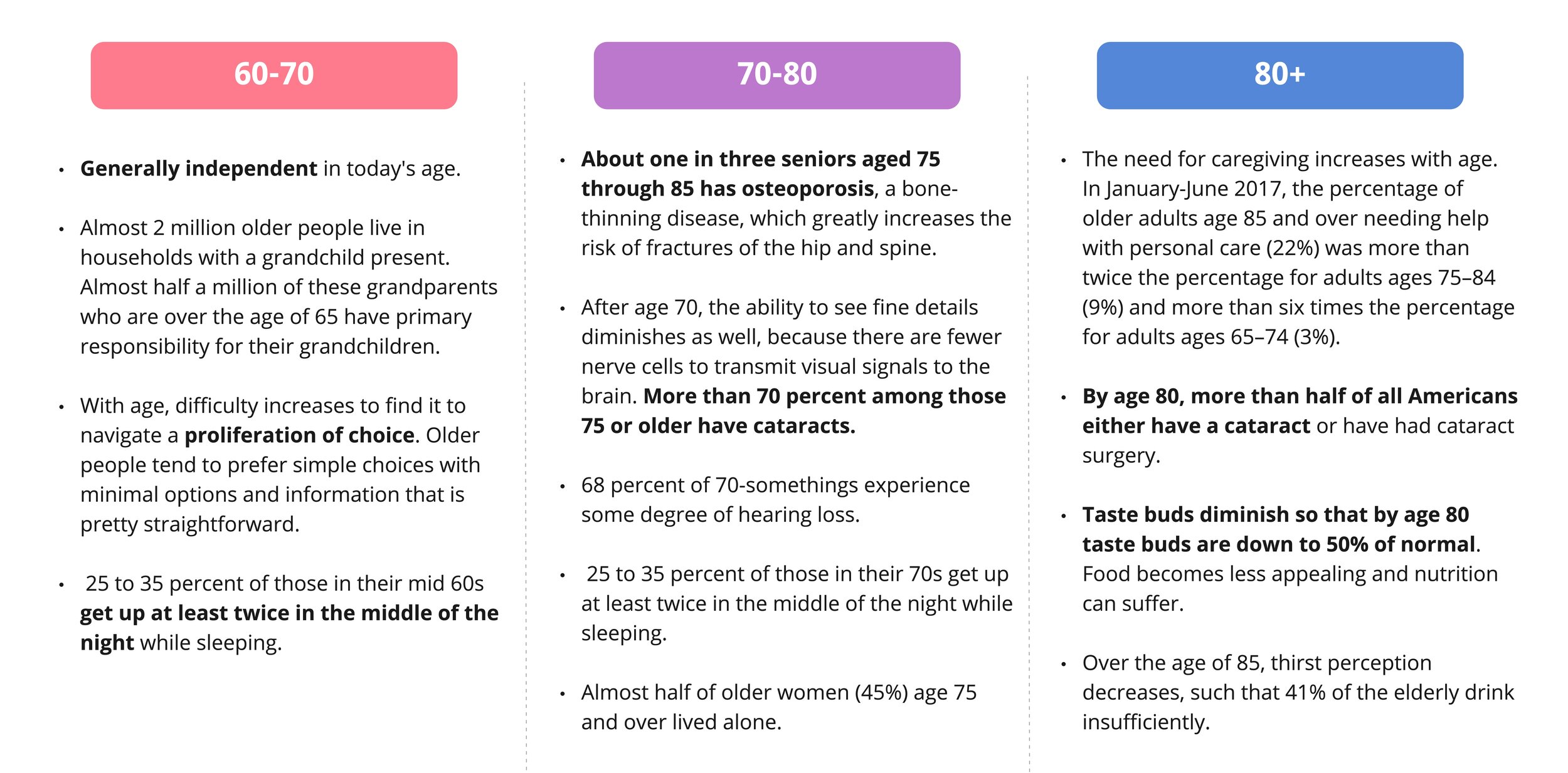
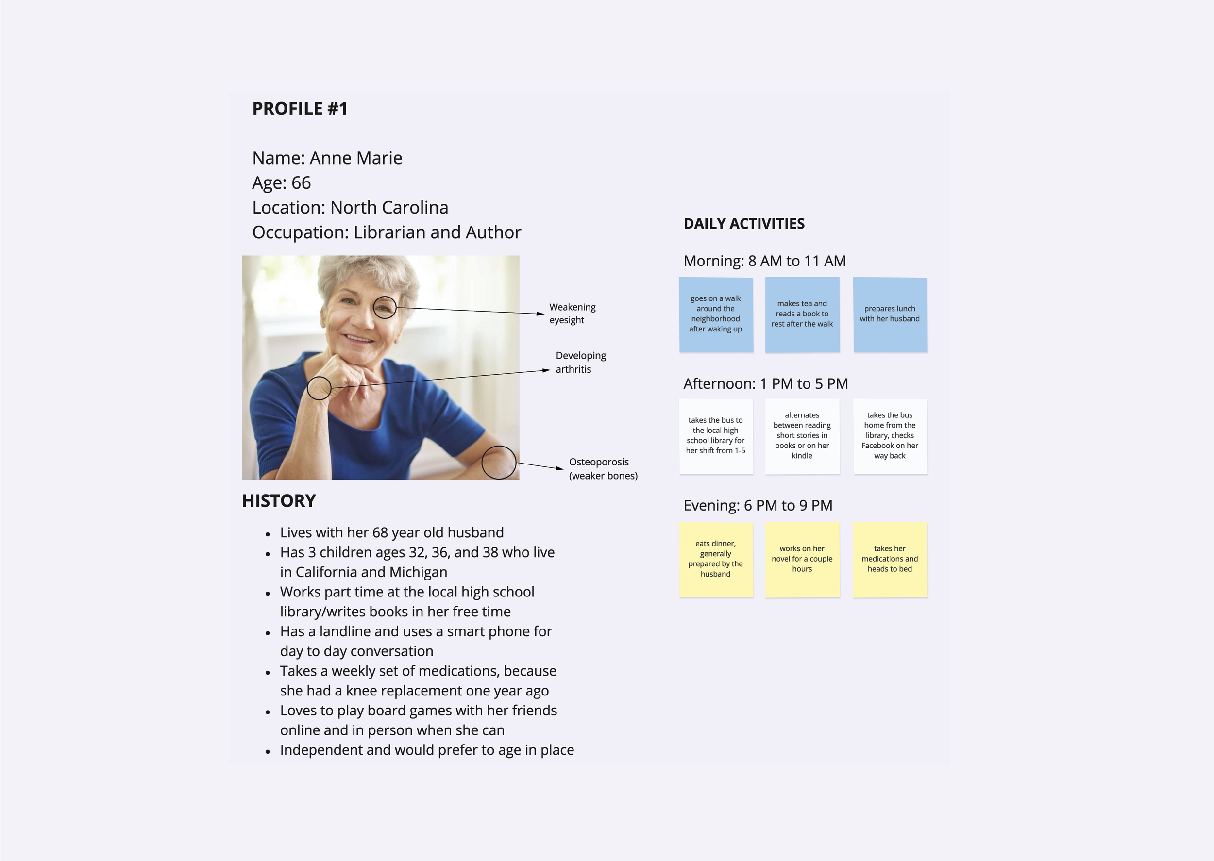
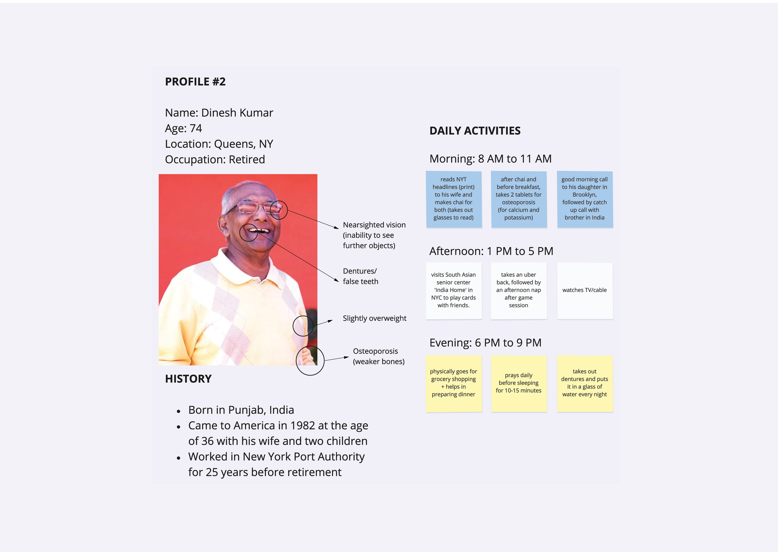
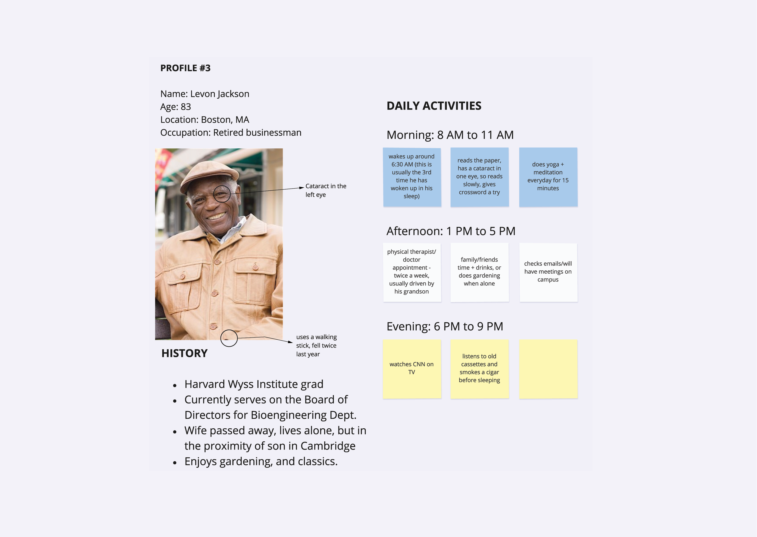
USER RESEARCH: After we had our final opportunity, we interviewed three seniors all from different demographics to understand their needs. Due to COVID restrictions, we could not do any in-person interviews, but harnessed the phone and Zoom to better understand our user group to build user personas and journeys. Their needs were further sub-classified based on their age groups.
CREATE
CONCEPT GENERATION: After identifying customer needs, there were two questions that we wanted to answer. First, what is FedEx Silver, and second, what is it not? We mapped out possible services based on the category, such as health or technical support. We also mapped out features such as offering driving within a certain radius or pre-determined routes for the FedEx Silver drivers.
We built a pros and cons list based on our initial services to understand which are the most important. We did this by analysing if a service solves a real problem for our users and the pros and cons of offering each. A delighted note was added next to latent or unfulfilled customer needs.
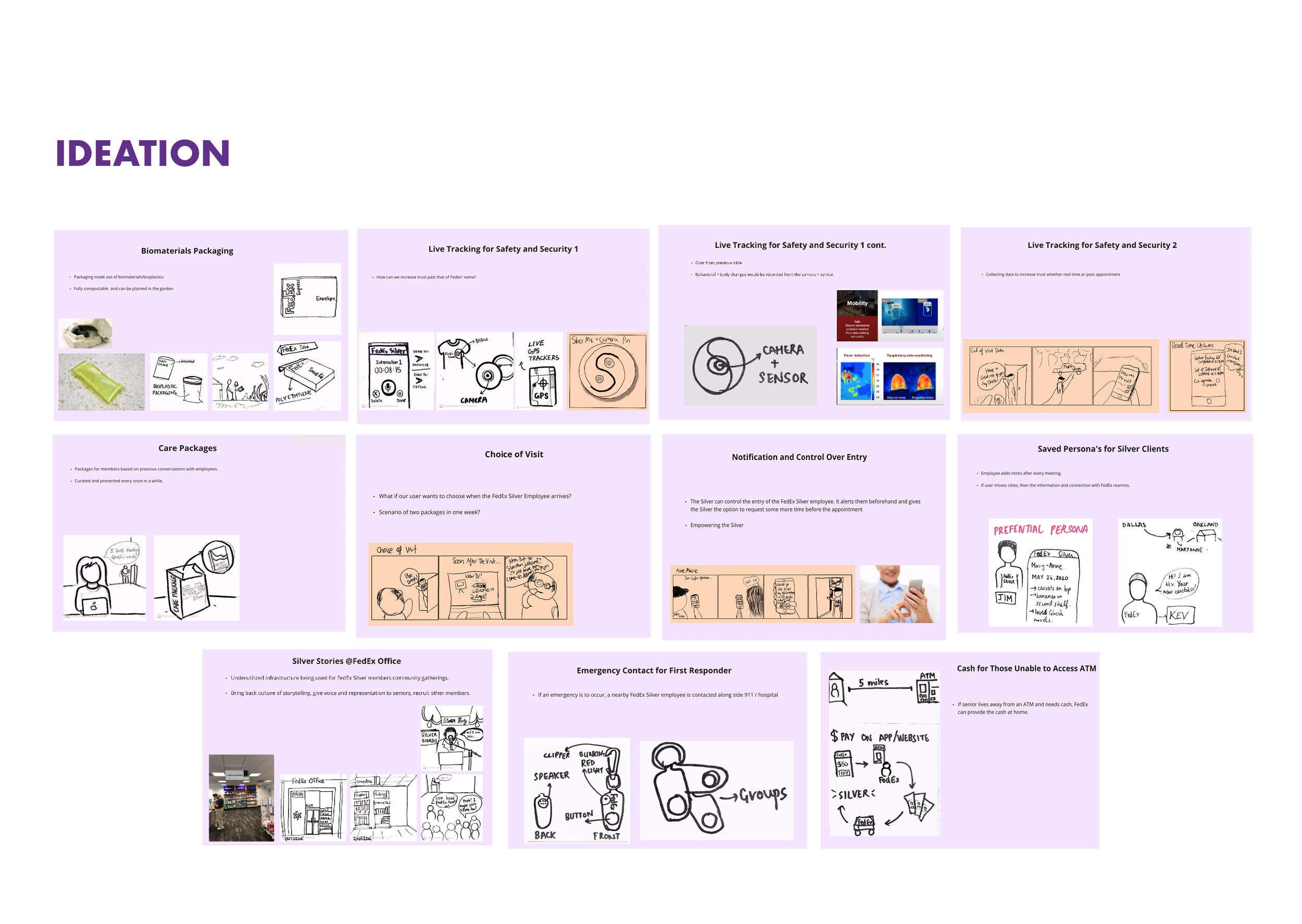
We approached ideation by sketching out user journeys for each of our three user profiles. We then broke down each physical interaction that may occur during the journey and created features that would address issues or concerns that might come up for each of our shareholders. Some of our features had to do with security for the Silvers and Companions, while others had to do with allowing the Silver’s family to have a role in the FedEx Silver interactions.
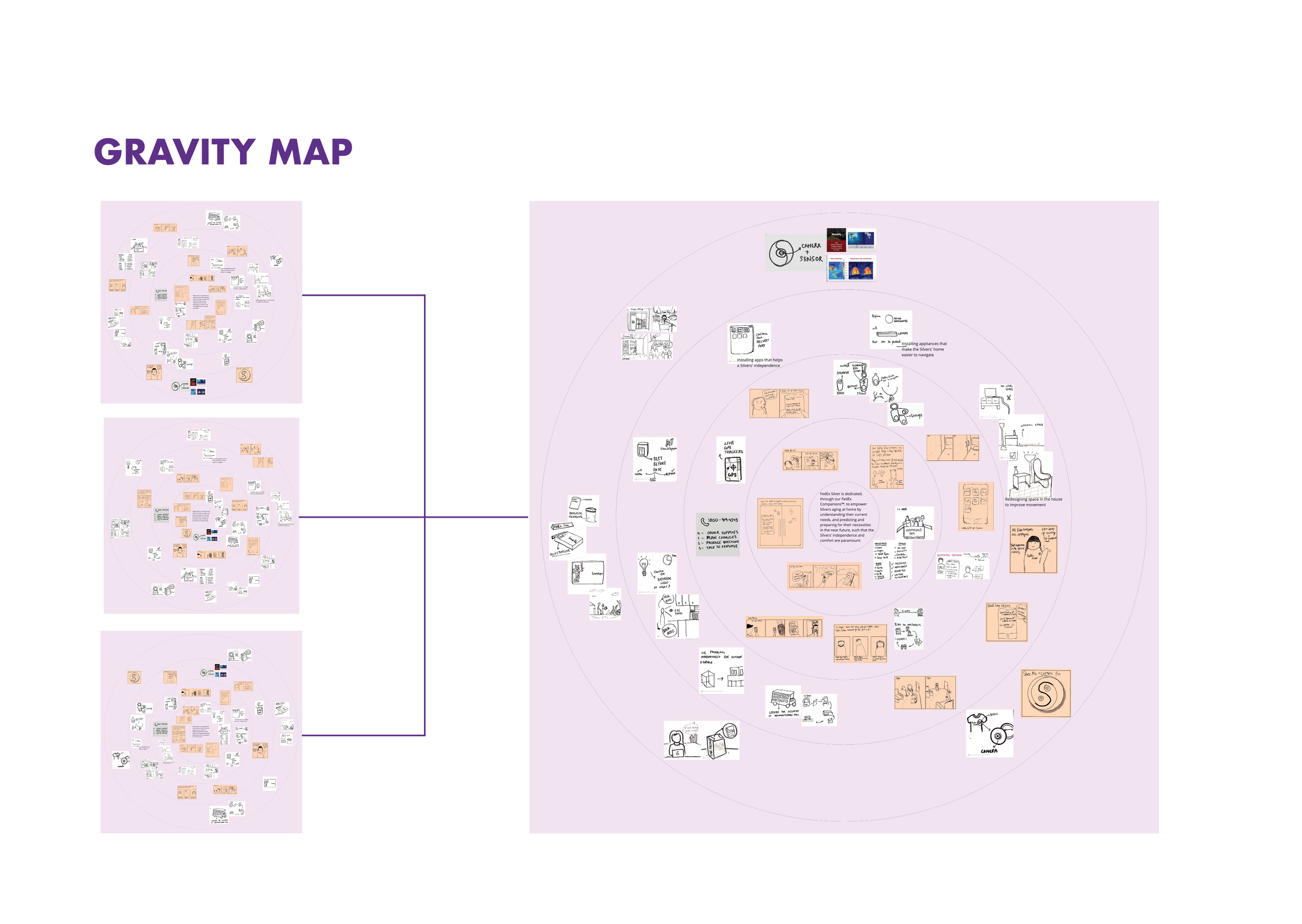
With a set of features defined, we embarked on one last process to help us bring the final version of FedEx Silver into clear focus. We developed three cores that best encapsulated what FedEx Silver was. All three cores kept the Silvers in the center but highlighted different principles.
We then created three gravity maps, seen below, that housed the cores at the center. Then the features were arranged all around the cores to visualize what mattered for each core. The closer to the core, the more integral. We then created one last gravity map with a new core at the center. The final core was based on feedback from stakeholders and peers. This last map helped us flesh out the final version of FedEx Silver for our pitch deck. At this point, we had a final features list and a clear vision of what FedEx Silver stood for. The last step was to develop a visual language to illustrate our system in the pitch deck.
IMPLEMENT
DESIGN BRIEF - We implemented our concepts and developed our final design brief, user journeys and logistics platform.
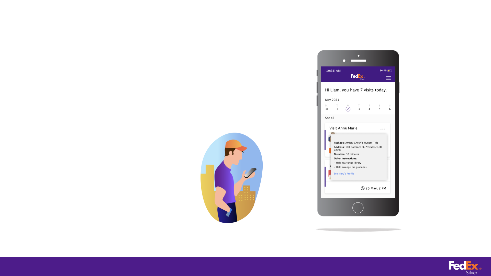
USER JOURNEYS - Introducing our first user Anne Marrie, a 67 year old woman living in Memphis. She is mostly independent, but needs an extra pair of hands in daily chores, that require heavy lifting for example. To illustrate these core features, we depict the first interaction of our FedEx Silver Anne Marie with our FedEx Companion Liam. All the illustrations below are designed by myself.
Dinesh Kumar is a 74 year old immigrant living in Queens, NY. Dinesh’s daughter books the service for him. It’s important to realise that this is their 6th interaction so there’s already comfort and understanding between the Silver and Companion.
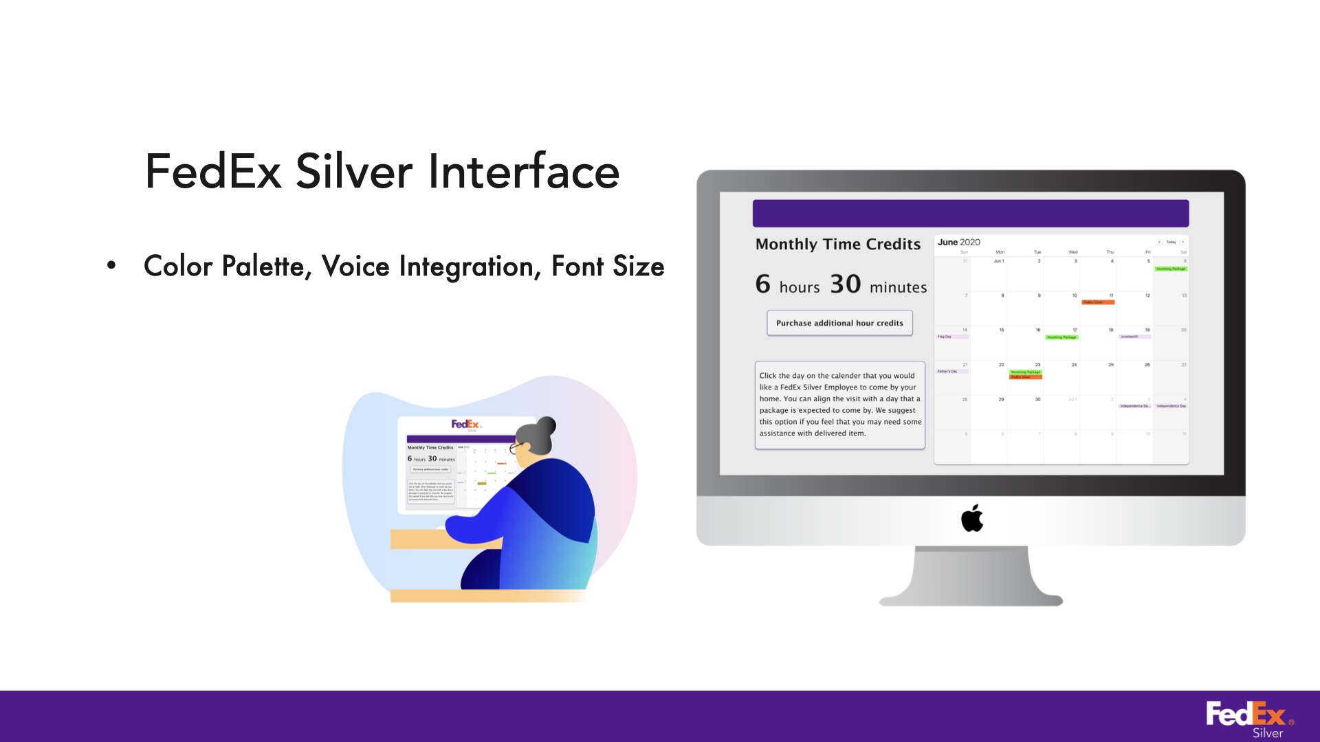
Power Logistics - Companion’s UI is built off FedEx’s existing logistics platform. Features like Preferential Persona help in storing not just companion’s needs, but also desires. Silver’s UI is built keeping accessibility at its core, with features like voice integration, warm color palette and larger font size to help make the digital interaction process smoother for Silvers.


